We are now in January 2018. After soliciting sketches form another graphic designer, the association got back in touch with me, not satisfied with the suggestions they received. My brief changed slightly, to include a graphical element, in addition to typographical branding. "Make it like Bosch, or Siemens". The trouble for me, from a graphic point of view, is that neither Bosch, nor Siemens, has a bilingual subtitle that needs to be included in the branding.
This is a challenge on several levels: the first one being that the client needed to be made very aware that they will be displaying their logo at small sizes and that there are only so many pixels in a logo that is 50px high. The same thing applies to print, though to a lesser degree- tiny print still has a higher dot density than most screens, can therefore smooth a font better. Most of this can be solved with vector graphics, but not all browsers support them.
The second one is that I have done some research into bilingual type display and am still looking for a satisfactory solution to making two scripts, one running from right to left, the other from left to right, display with equal legibility, allowing them to be simultaneously read at first glance- that's what the next part will be about. In this part, I'd like to focus on how we moved from geometric patterns to puzzle pieces to a square kufi font. Please keep in mind that all that follows are not finished, but rather sketches I'm rendering as is, warts and all.
Pattern Madness
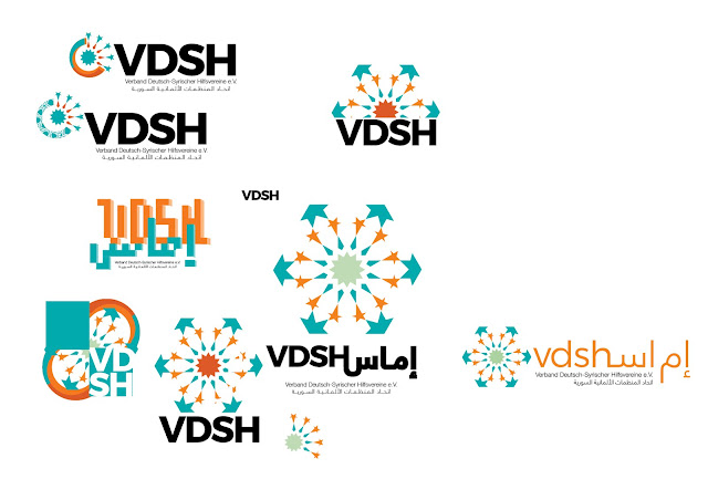
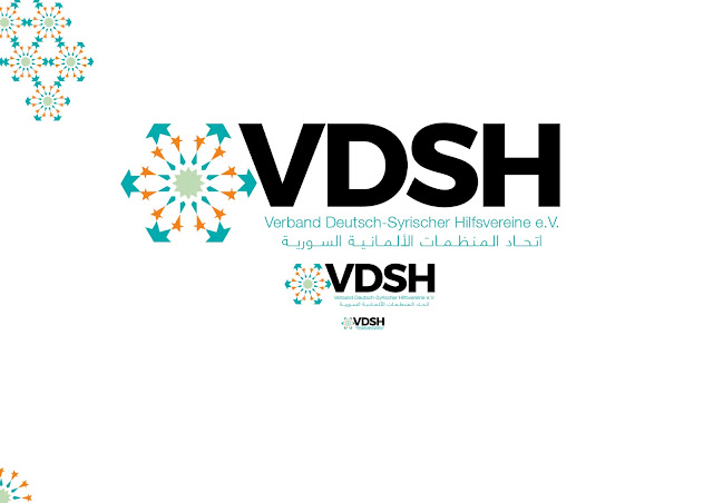
In the last part, I showed the initial sketches for the logo. Some of them include a geometric pattern, based on patterns found in the Mosque of Al-Nasir Muhammad in Cairo. Originally, I had wanted to base it on the Great Mosque of Damascus, but found that the more complex pattern of the former was more expressive and allowed for more variation through scaling and cropping. I also wanted to include three colours in the icon, to represent community, common goals and contributions, which again was in favour of the more complex pattern.
I would have preferred to avoid this kind of representation altogether, as it is, in spite of mathematical secularity, a type of pattern that connotes religion in many minds. I was, however, happy to undertake the experiment, as geometries are always fun to play around with. An interesting resource in this context is Islamic Geometric Patterns by Eric Broug (Thames & Hudson, 2008), which explains how to create them, and gives a decent historical overview of the various patterns used over time.
The trouble with this complex approach was simple: the pattern, as I was planning it, would be too detailed to be easily "read" at small sizes. This, in addition to the subtitles would result in a logo that was very busy and had too many parts for me to feel entirely comfortable with, though it was pretty.
Pieces in a Puzzle
As the brief did not specify what kind of icon was to be used, it allowed a lot of space for thought. Here is one thought:
The VDSH brings together 25(-ish) different associations and aims to facilitate their work through knowledge exchanges, trainings, project management. It's main foci are integration, humanitarian aid and developing the capacities of their members. Having some knowledge of associations and how they collaborate, one of the first things to spring to my mind was that usually, it is how they connect that defines the quality of the collaboration. Having a central unit dedicated to management and communication of joint activities is the connection that brings it all together- hopefully neatly. Visually, my mind quickly turned to puzzles and the missing puzzle piece that brings the image together. And so, I set out to make a puzzle of my own, as it would be more legible than the first, ornamental attempts and that it would scale better.
Morning Kufi and Coffee Houses
One of the ideas that had been floating around since the beginning was to use a square Kufi script, both as a pictoral icon and as a font for the subtitles. The Kufi style has regained some relevance in past years, especially as a screen font, as its reduced lines and cleaner connections make for a more pleasant reading experience, especially at small sizes. That it is square also makes it fit very well in the pixel age, in which much of what we see happens on screens, and what we see on those screens is made up of square pixels.
My earliest "serious" sketches include a monospaced Kufi font I developed specifically for that use, mostly as an experiment to see if I could to it and what it would look like when I did. On a personal note, I still like the brutalist visuality and cleanliness of that experiment. That lead to further experimentation in patterns and attempts to display the entire subtitle as a square Kufi construction, in the knowledge that it would never work as a logo. In the process, I discovered a brilliant article by Joumana Medlej, which answered many questions I had regarding proportions, rules and playful ways to design a square Kufi. As most of my knowledge of calligraphy, Arabic or otherwise, has been acquired through years of writing, reading, and then writing some more, I am always grateful when those who have trained with masters of the art share what they know.
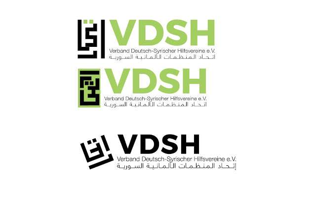
The request to design an icon in the kufi style came later into the development process, after looking at the walls of coffee houses and some mosques. We based the icon around the word "Itihad/اتحاد", the first word in the Arabic name for the association- Union. In spite of my initial doubts at the clarity of the communication, I soon began discovering ways in which it enriched the semantics of the language of the logo. It took a few tries to reach a result that felt "right" in regards to legibility and clarity, but the results were immediately more satisfying to all involved than our previous attempts at finding a way of expressing the personality of the brand. What became apparent rather quickly is that fitting the whole name into an icon would be difficult.
The advantages to this icon were clear, as was the icon, though it did need some adjustment, which it would receive, as this is the icon that entered the second stage of production.
Next time, as announced, will examine the various experiments this logo allowed me with bilingual type and legibility.
//
All views my own. Pardon the pun in the title- as a big fan of Jim Jarmush's celebration of that combination, it was too obvious not to make.


Comments